Return & Problem flow in Klarna
Smooth resolution and user delight
In an agile squad, we were tasked to improve the current “Report a return/problem” for customers who made a purchase with Klarna payment methods. Closely collaborating with the Group Lead who was the PM, and I was leading the UX & UI. We identified user pain points from existing Customer Service’s data and chat logs, created smoother user journeys and defined new features.
Among other enhancements, I created a more coherent way of working with the PM & engineers, improved return and problem scenarios and a smooth responsive experience that still connected with the other work streams in Klarna’s Post-Purchase.
The response was very positive with proven business impact. We worked in rapid speed while still ensuring the process was lean and healthy.
What do the customers want?
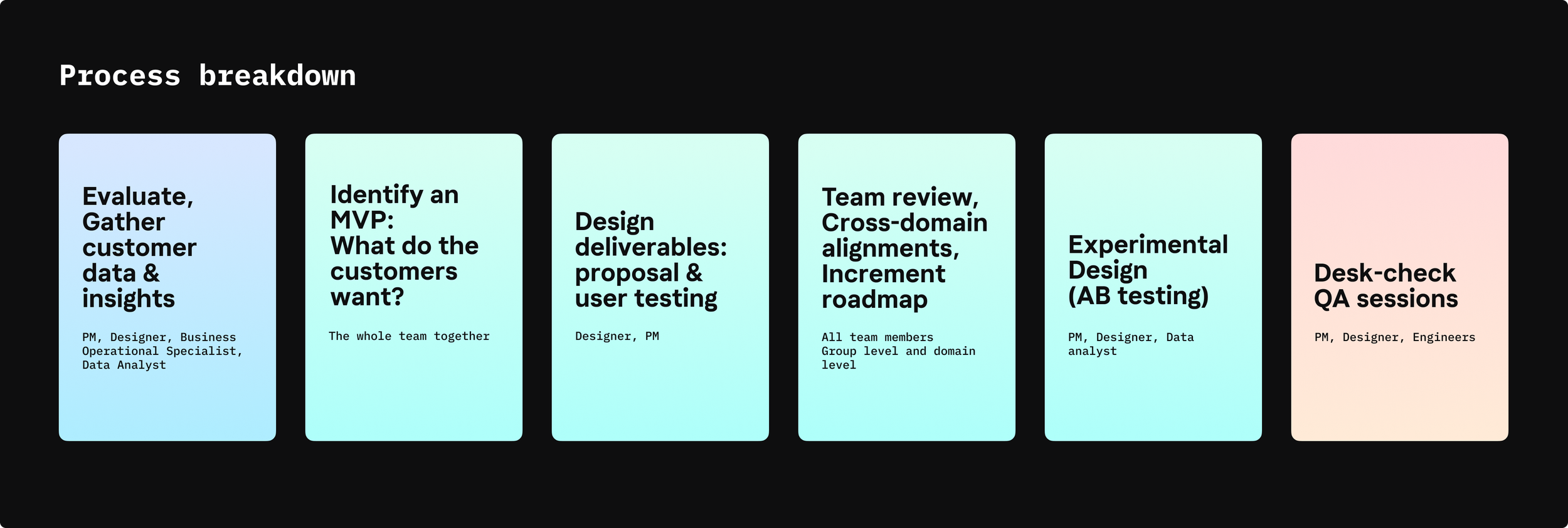
I joined the Return & Dispute group right after the re-organization in summer 2022. We did not have a complete design inventory of all the scenarios and market segmentations when Klarna customers report a return in the app. Since every Klarna payment method is unique (Pay now, Pay later and Pay in parts); I and the PM decided to sit together and worked on the most basic journey of a Return flow.
We agreed that the outcome of the journey is always the Refund and Payment Settlement and with a simpler, more at-ease experience, customers will be satisfied with our Self-service’s Return flow.
And why not making Refund journey more joyful and rewarding?
What do we work with? What are the problems?
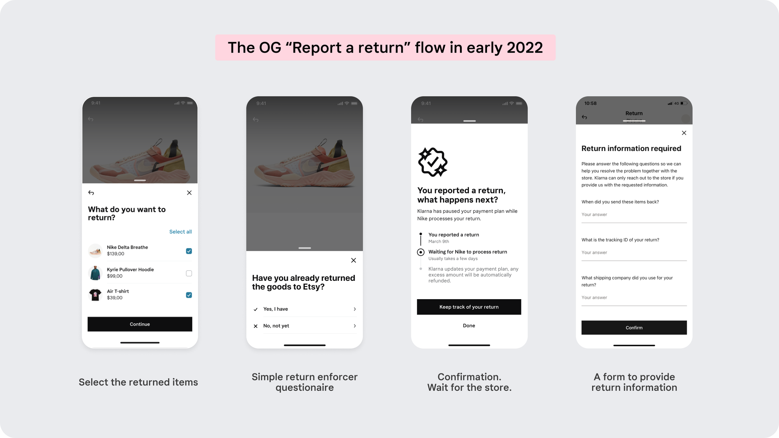
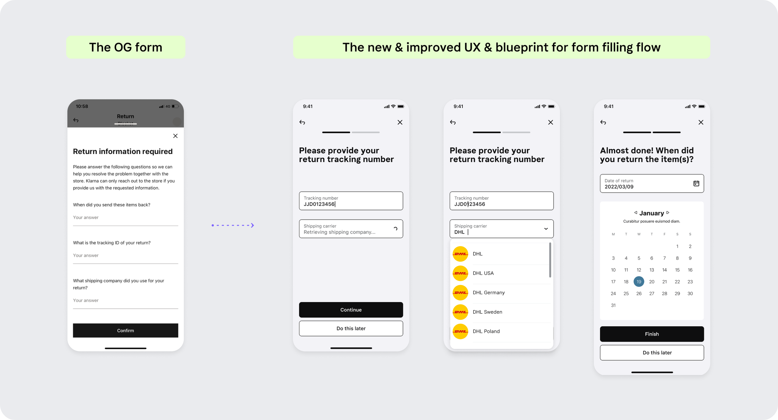
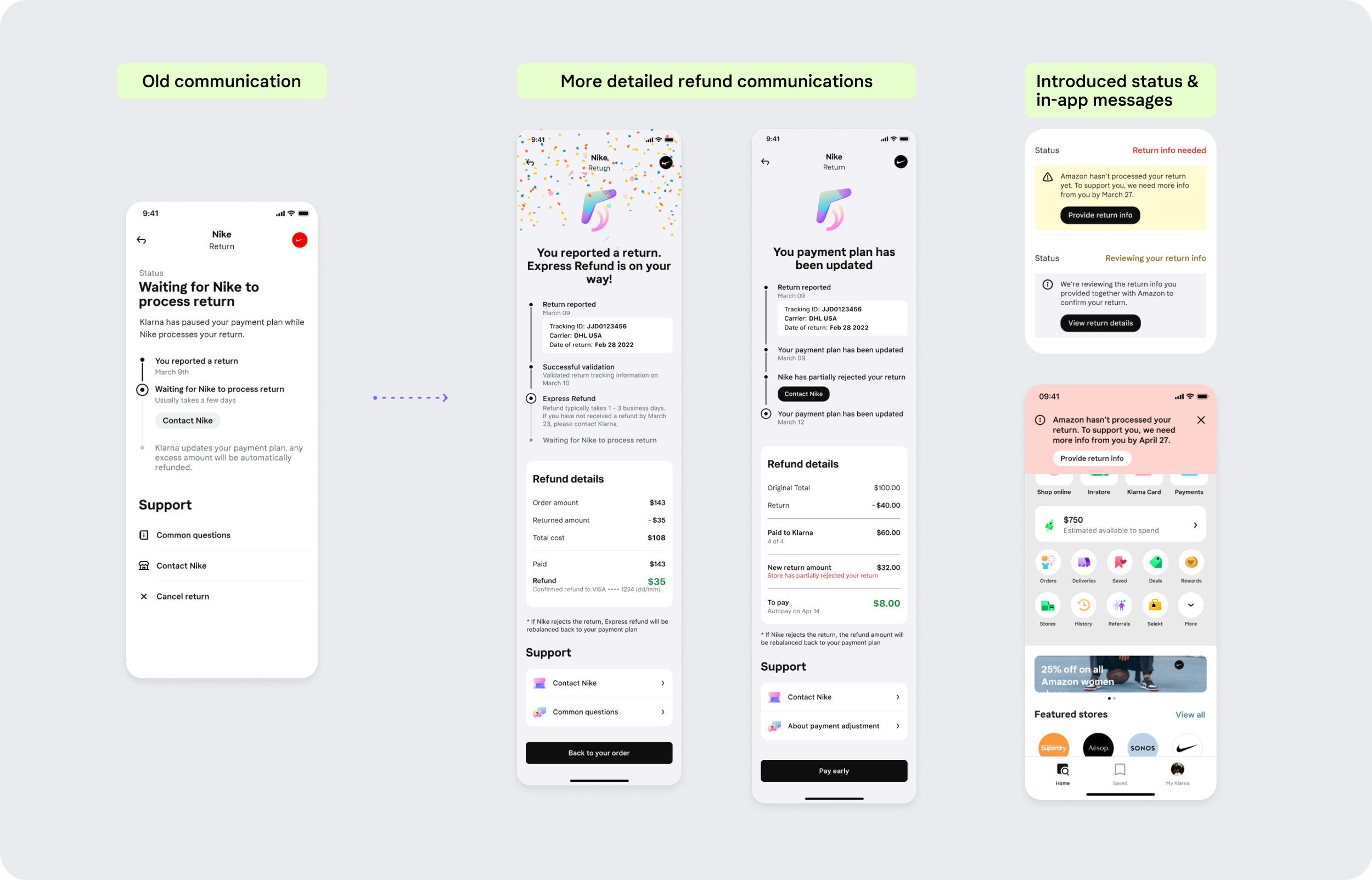
The old flow was form-heavy, and lacking guidance & communication design to inform the customers the right expectations: “Why do I have to report a return with Klarna?”, “When do I get my money back?”, “When does my payment plan get adjusted?”, “What do I have to do to get my money back from Klarna?”
We analyzed carefully the customer service’s chatlogs, agent calls and talked to different operational teams in the domain to gather datas and feedbacks.
We also had to align with the new Design System in Klarna
We lacked communication components such as in-app messages, status banner and onboarding elements
The Customer Service channels received a generous amount of errands because the customers could not rely solely on our automated flow
The return information form is dull and long
The refund communication is insufficient
“Customer did not provide enough information to describe their problem has also increased globally by almost 50% (UK & Germany leading)”
“I was told that my refund from Klarna went through, but I’m only seeing part of it on my card. When I contacted customer service they let me know that the other part went to a different card. That would have been good to know and could have saved me time and a headache”
Defining the experiences
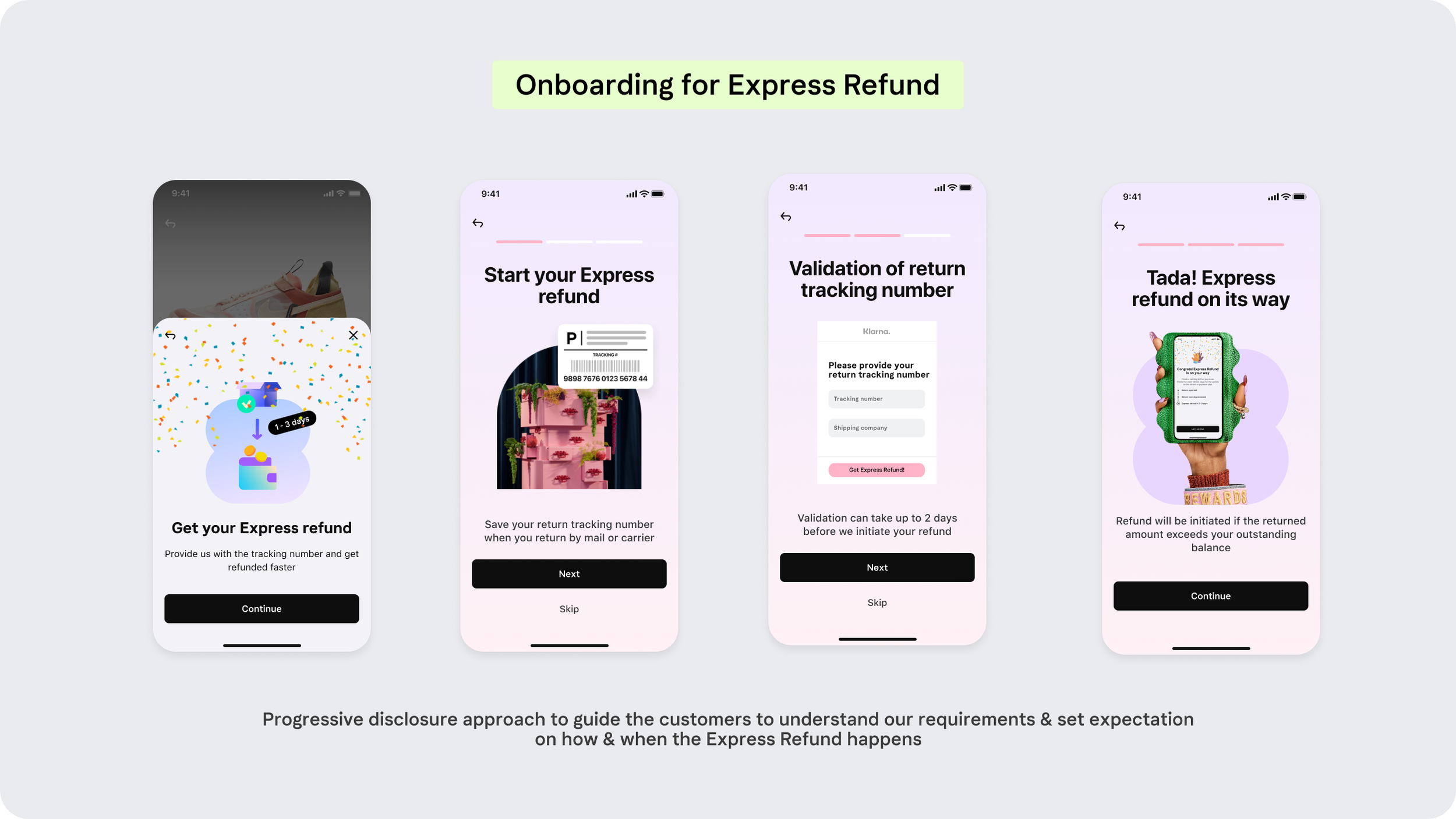
Educate the customers that after returning their items to the store, they will need to Report a return in Klarna to get refunded through us, or to get their payment plan adjusted (with Pay later and Pay in parts).
The Report a return journey in Klarna has to be simple and reliable. The customers should not feel like they have to contact our Customer Service for further guidance.
Incentivize the customers who have proofs of return: Faster and Instant Refund
“Customers do not care about how they do it.
They just want their money back fast & safely.”
Test as we go. Ship in high quality.
Not every single design process is the same. It is important to understand team resources and keep a clear mind on priorities.
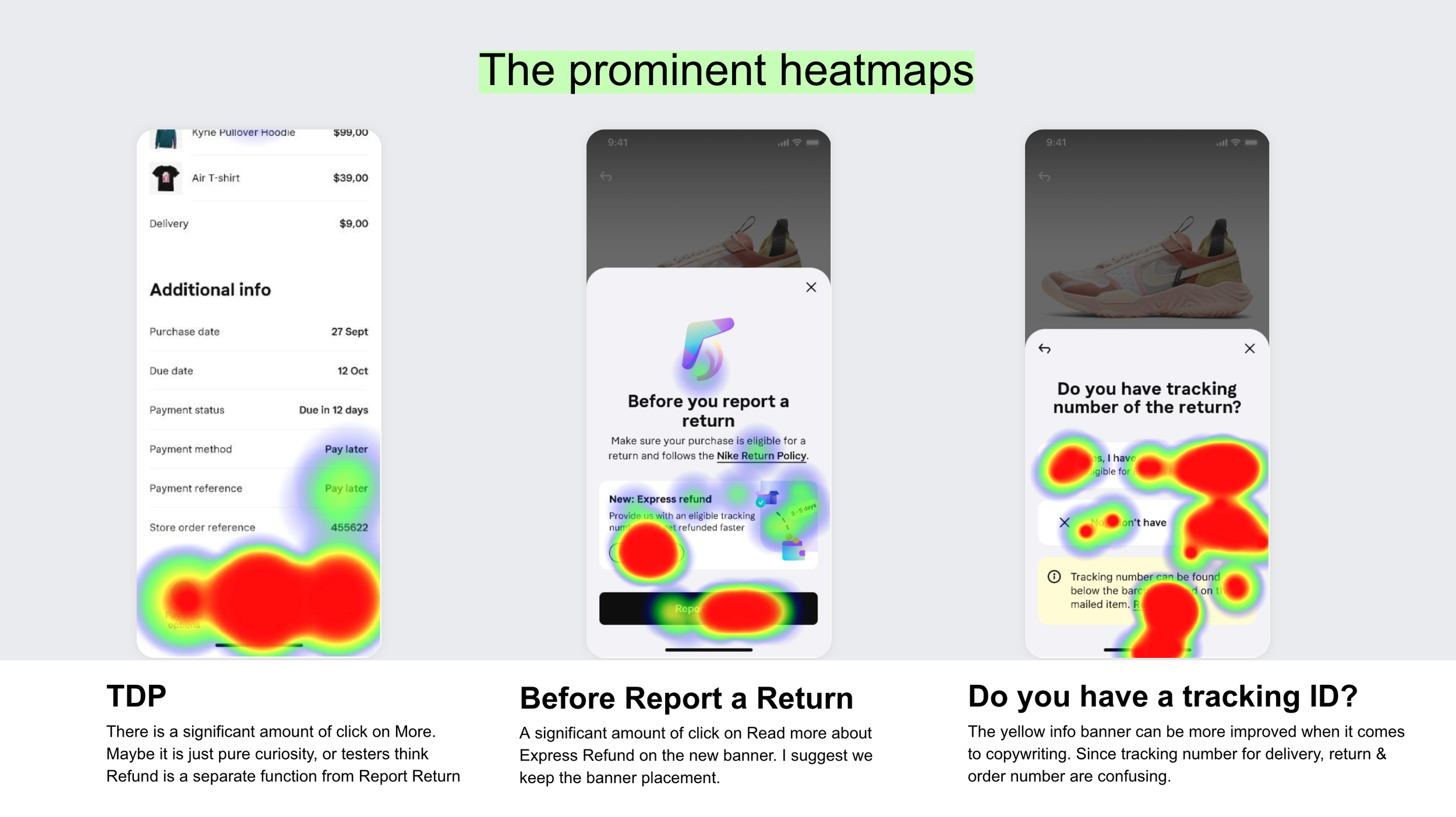
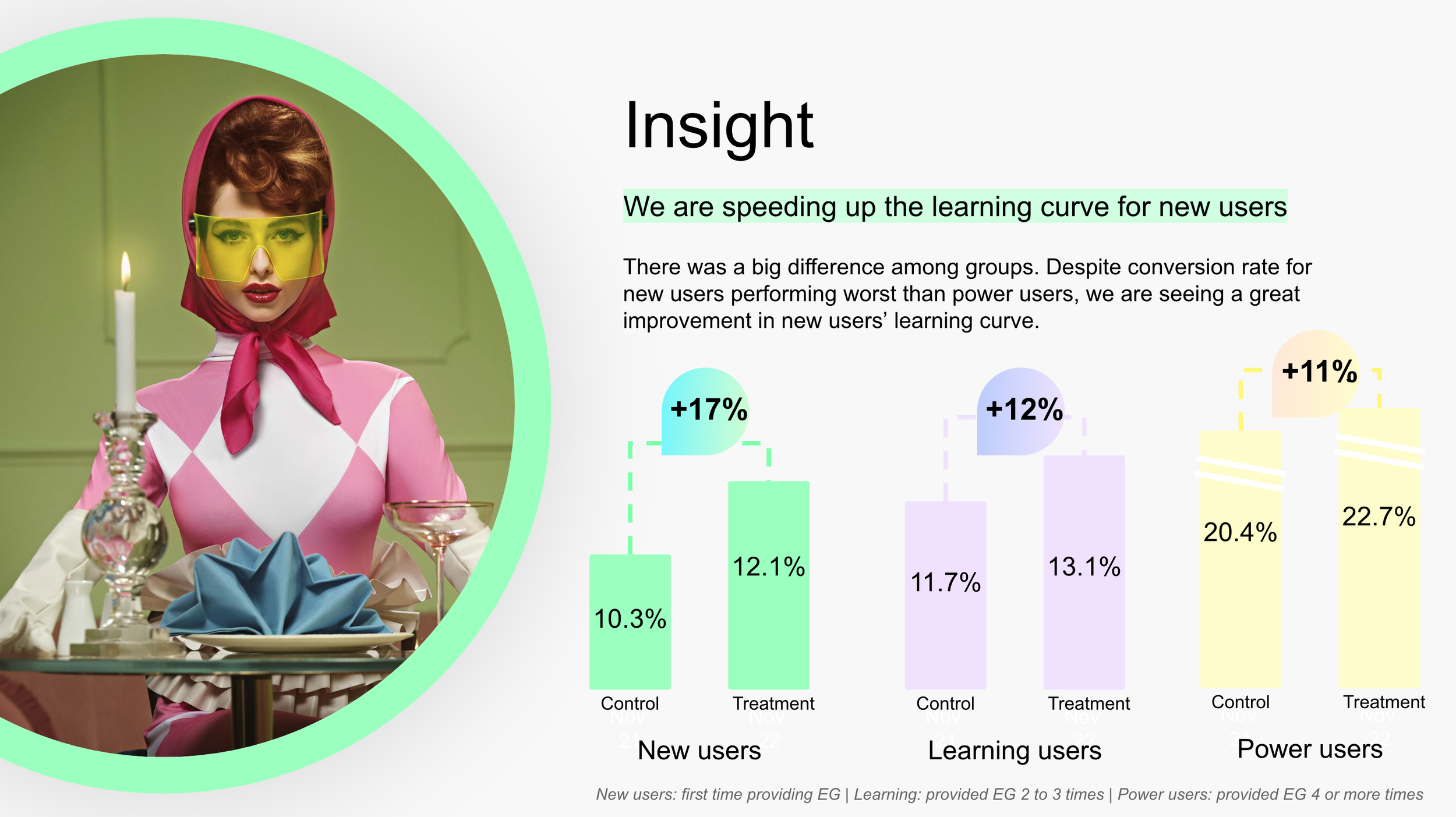
We conducted user testing for smaller flows in order to validate the usability, together with AB test and experimental design for markets and segments of customers that require further credibility before going live.
PM, Data Analyst and Designer came together to validate what we believe in the new UX flow. I also joined the QA process with the engineers to make sure all the UI were implemented beautifully, and accessibly for most devices.
How we documented our testing insights:
Process documentation and UX direction
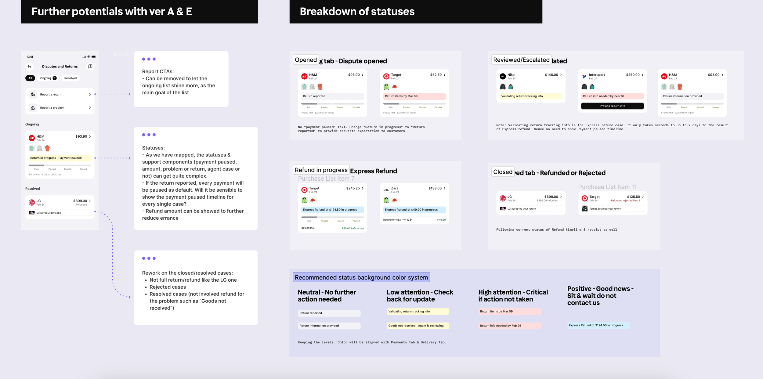
To ensure that the designers who contribute to the Post-purchase journey in Klarna app are aligned and aware of our problem space, I made sure to communicate and sync often, in order to provide the correct expectation and alignment as a Design Lead.
We had a bi-weekly sync to exchange customer data, and aligned our design flows and got support from the Design Lead if needed. My feedbacks and direction are often documented clearly on our Figma project page.
Small increment. Impactful results.
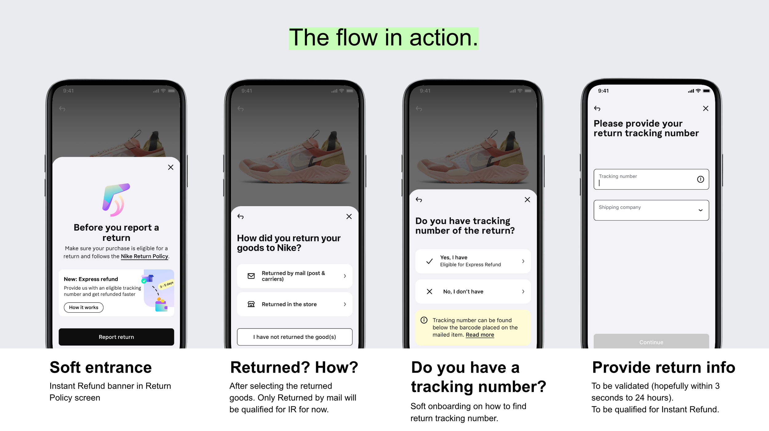
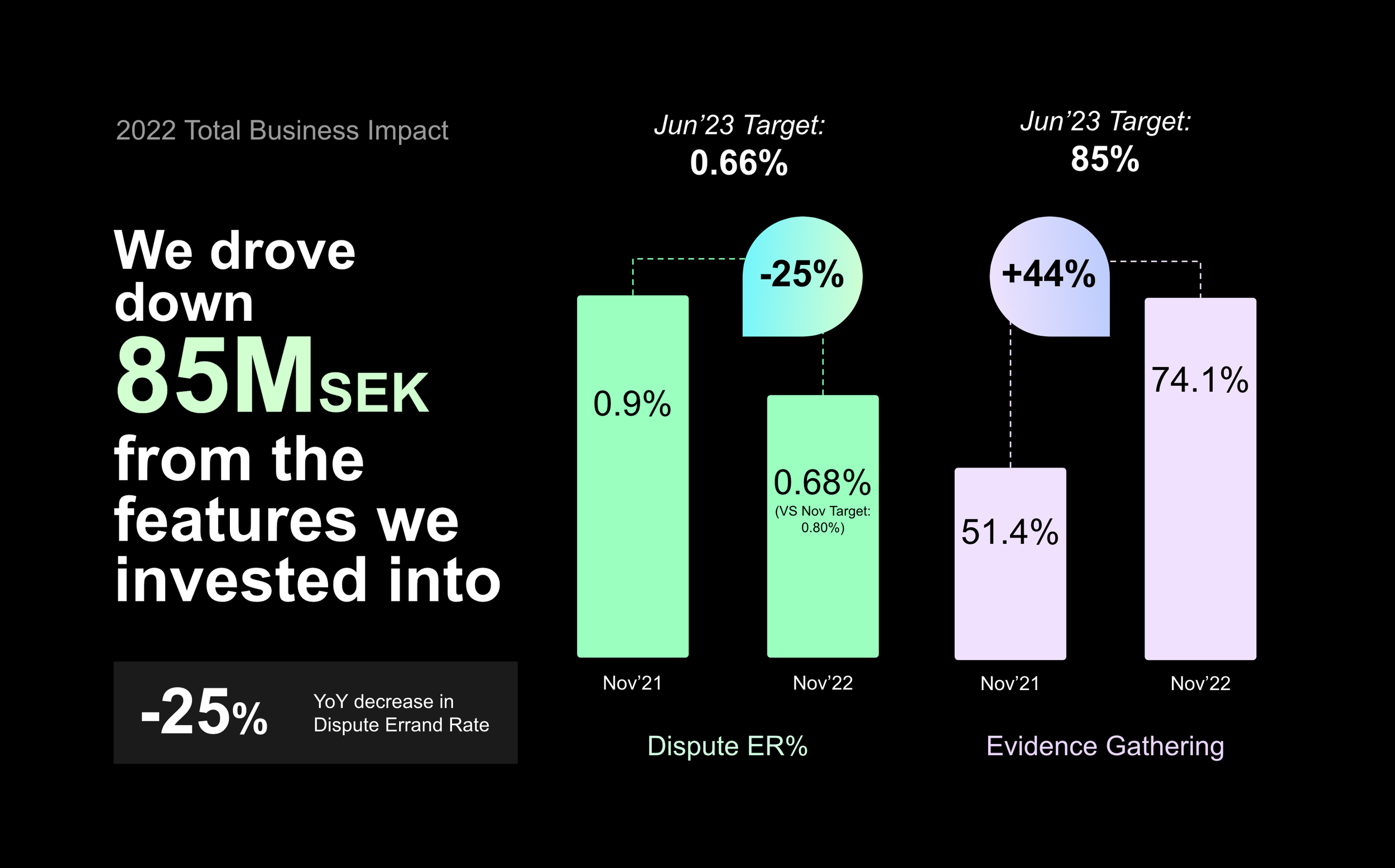
First, we delivered the refined flow of the existing Return & Refund flow in Klarna to monitor the reception. The business metrics that we measured were vastly improved. The new automated flow was able to drive down direct contact resolution to our Customer Service by -25% (Errand rate), and improved the Return tracking information gathering rate by a whopping +44% (Evidence gathering rate).
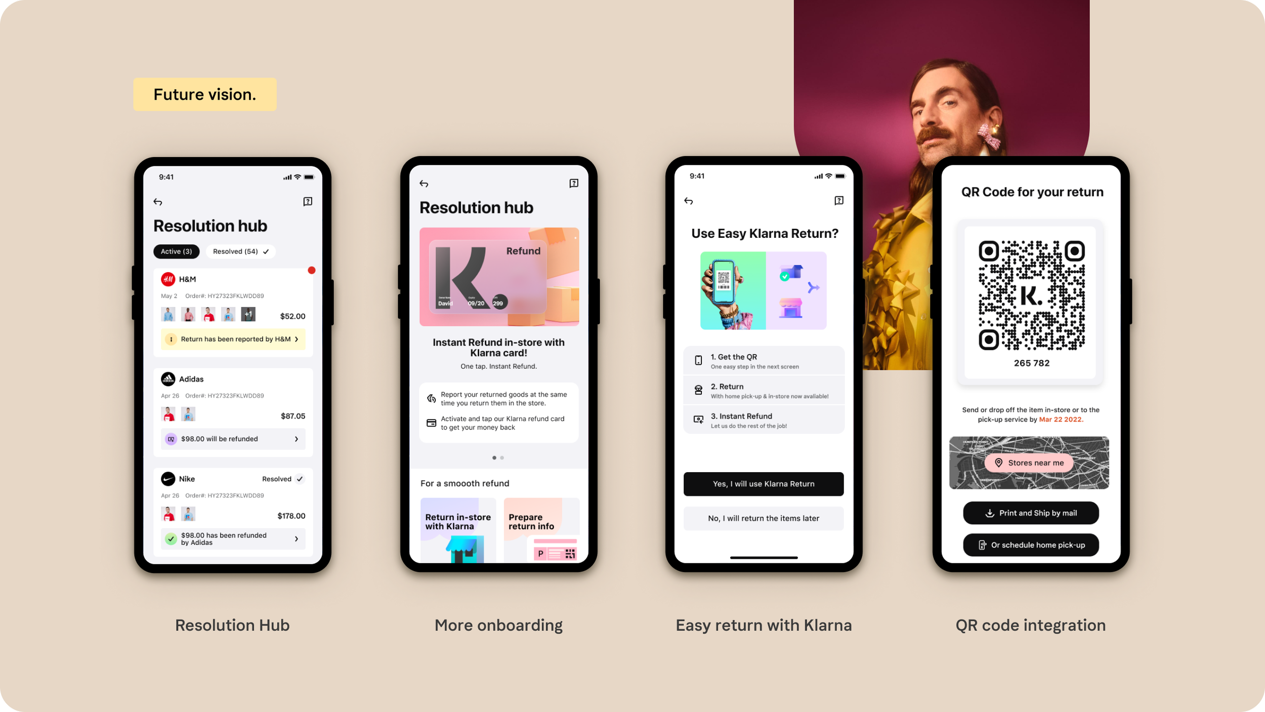
Next, we are implementing the feature of Instant/Express Refund for customers who provide proofs of return in the Klarna app; with careful Experimental Design & Testing in important markets and segments. We want to make the Return & Refund journey more rewarding and at ease for our customers.
Challenge the status-quo. Our vision.
I believe we can make the experience better by transforming a rigid Return & Refund flow into a warm welcoming Support hub. I was requested to craft a vision for Customer Service funnels from the Domain Director. And we received a proud feedback that it was one of the best vision we have had in the domain :)