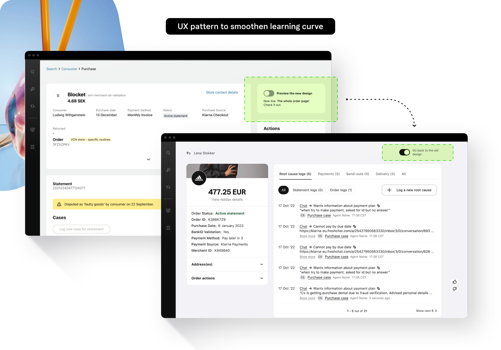
Agent dashboard revamp in Klarna Customer Service
One comprehensive platform that our Service Center agents use to help Klarna's consumers throughout their contact.
Building the Service Center Portal into the
At a company with the level of growth that Klarna has, enabling customer service to keep a high level is a challenge. Customer service at the same time needs to be able to scale both in terms of its size as volume grows, especially in new markets, as well as in terms of the services it supports, as Klarna service offering is made broader. To service customers well, the tooling needs to support agents in finding the correct information, and empower them to always do the right thing for our customers and business.
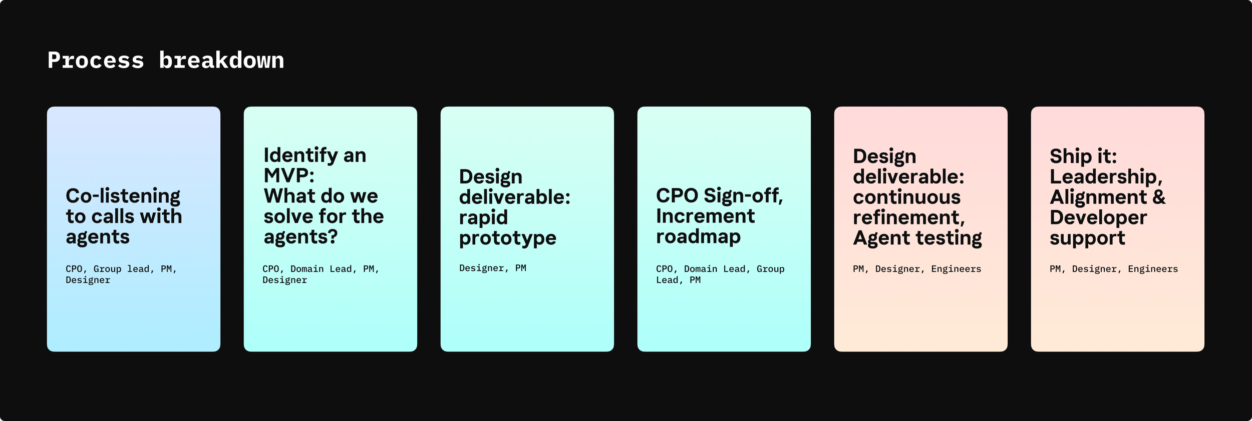
I have been specifically requested by the Domain Director and the CPO office to build a design vision for the Service Center Portal dashboard; and assist the Product Designer in the team to achieve the first MVP redesign and iterate on the vision.
The old dashboard UX & why do we want to revamp the dashboard?
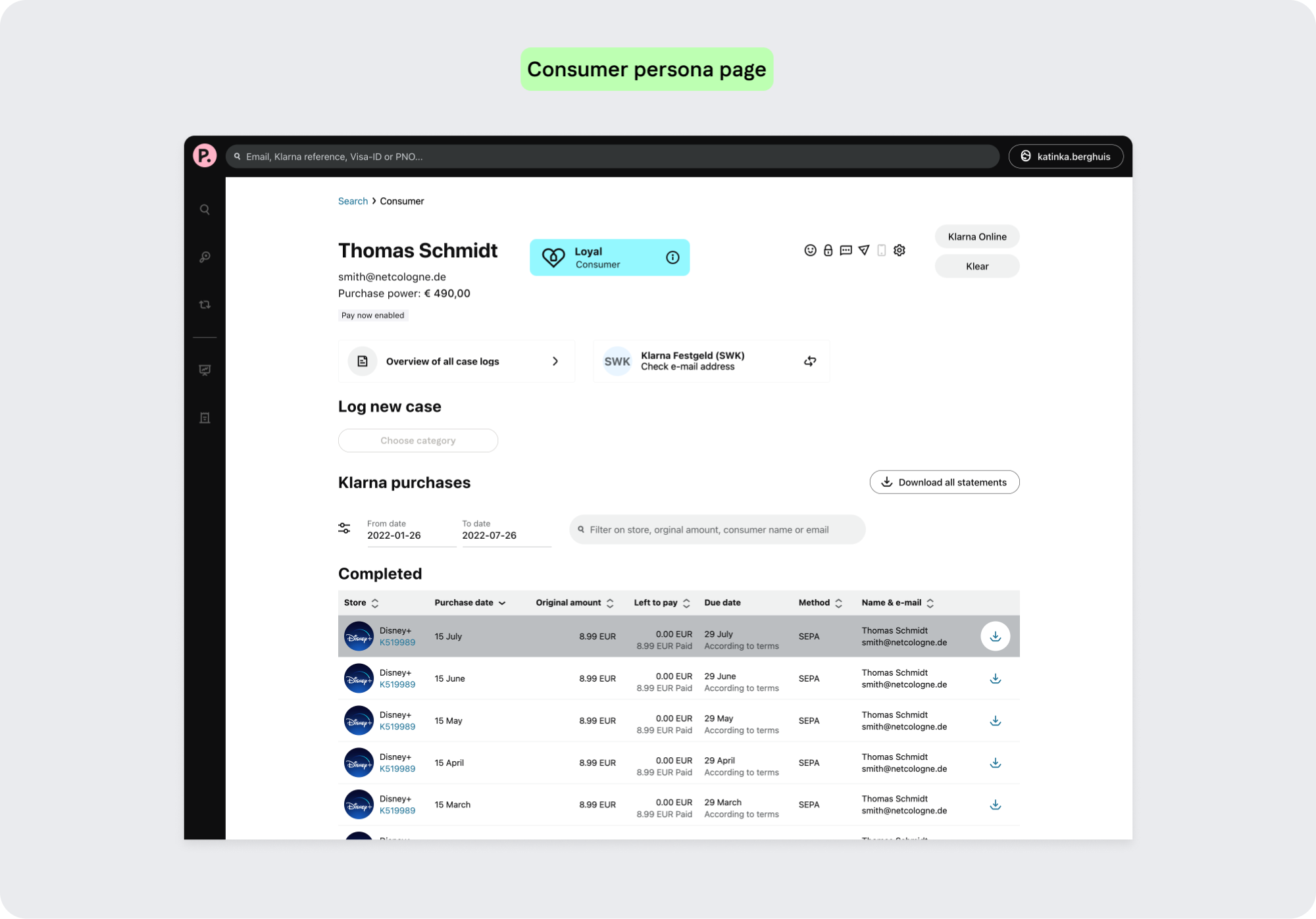
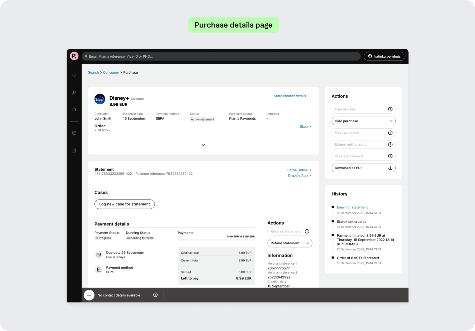
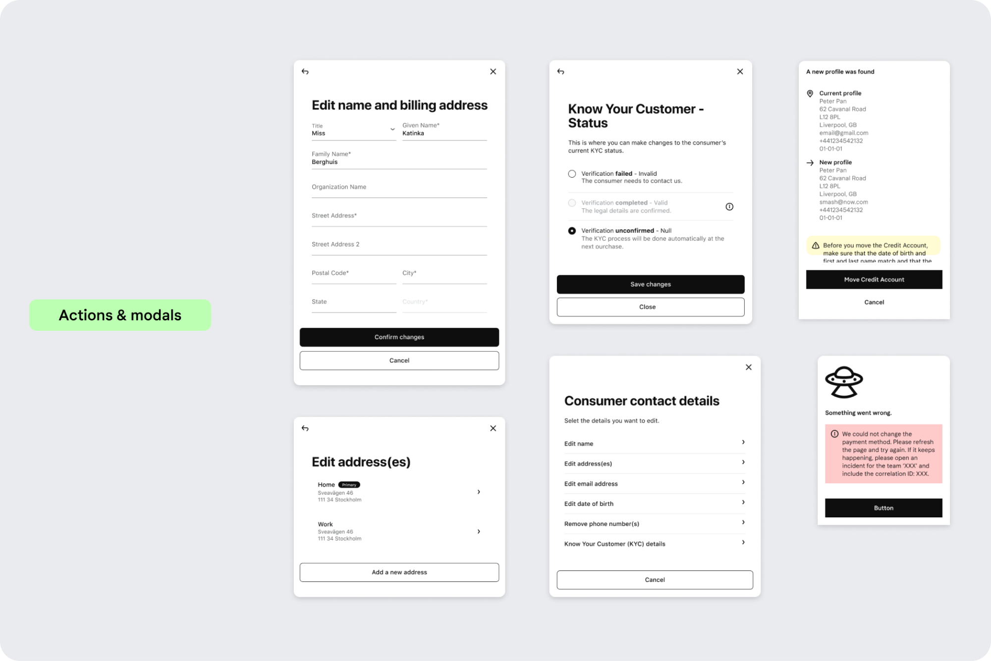
The dashboard was built on an outdated Design system version
Since many agents are of not Klarna employees (outsource), the prominent feedback was that many of them could not understand the Klarna Customer Service’s ecosystem by looking at the dashboard’s main pages.
Information architecture was loosely put together, and overall lacks a necessary hierarchy to guide the agents on the right actions to perform
Too costly to achieve the same level of information from the Klarna app (where consumer’s profile & order are displayed) and the information shown in the dashboard
Agent’s job is tedious and tough, hence the design needs to be more inviting, joyful and pleasing on the eyes.
And the Co-listening sessions with the Customer Support agents helped us gather very insightful data points for the user research process. We learned a great deal about what exactly the agents are facing on a daily-basic.
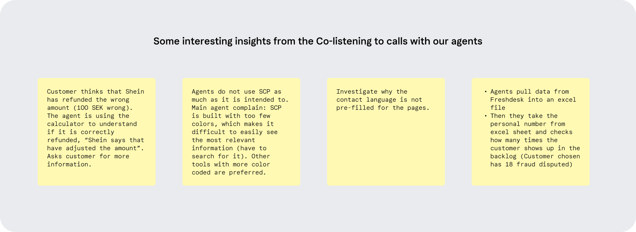
Defining the next generation of Service Center Portal
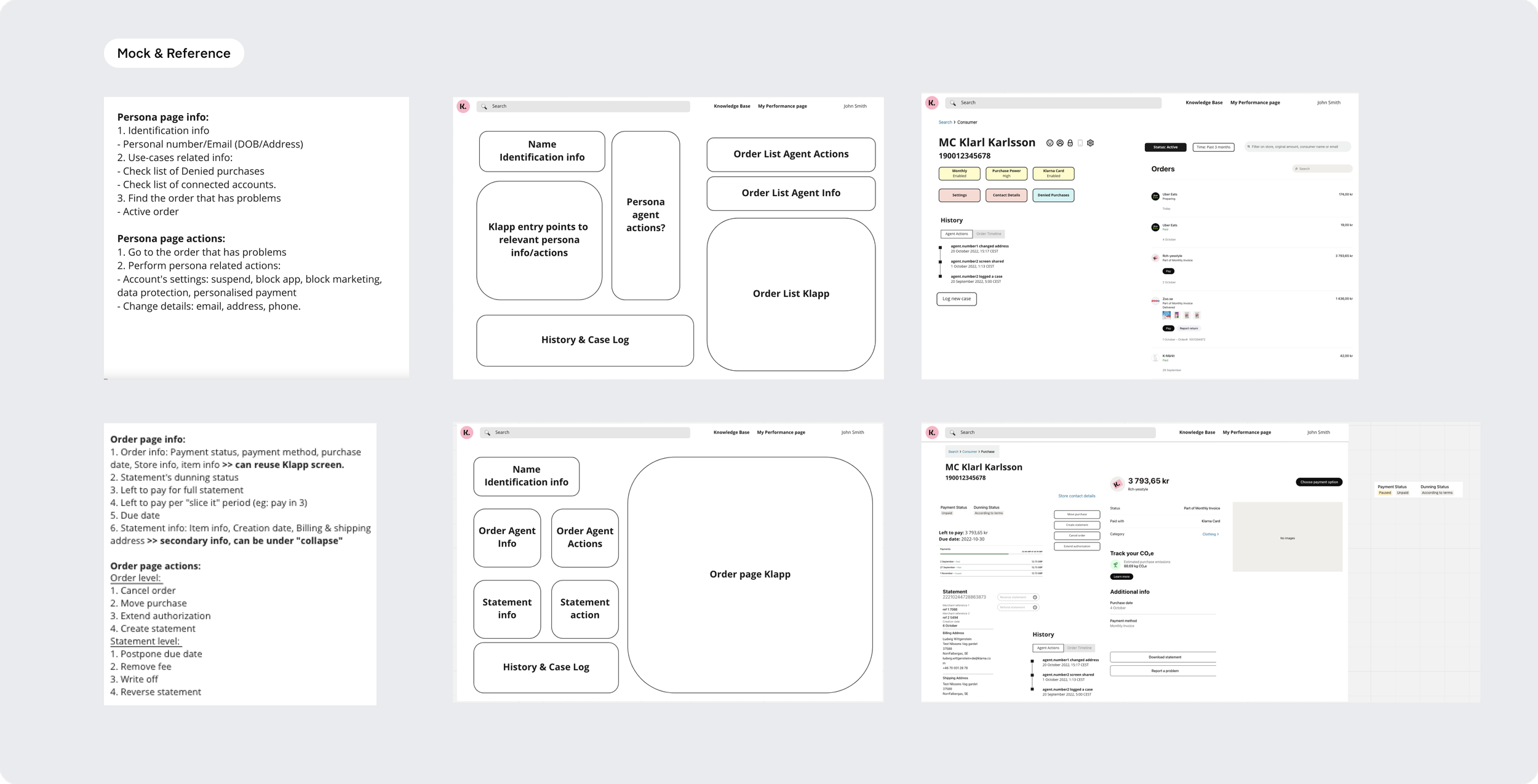
We want to reduce the cost of building new UI, at the same time provide a better experience for the Agents to do their intensive daily tasks. We also need to reflect correctly what the consumer sees in the app and information displayed in the dashboard.
The Domain Lead, the Product Manager and I brainstormed together and came up with a provisional mock-up and new direction. We also wanted to test a fun idea to re-use the exact view & UI of the Klarna app’s Transactional Details Page. I also aimed to test the freshly developed B2B Design system to support our Design Operation team as well.
The brainstorming & testing process lasted for 2 days.
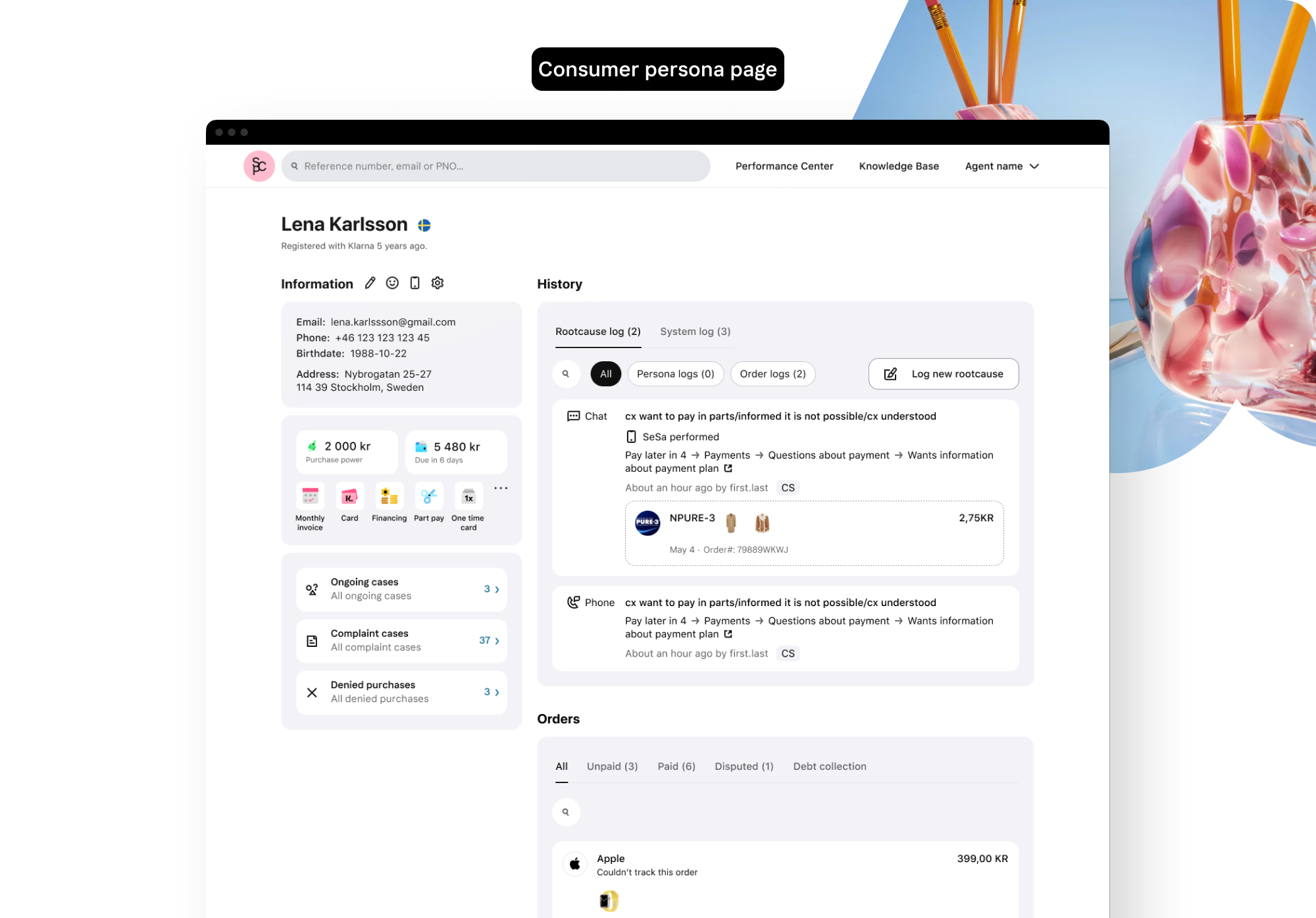
And then we gave it a fresh skin!
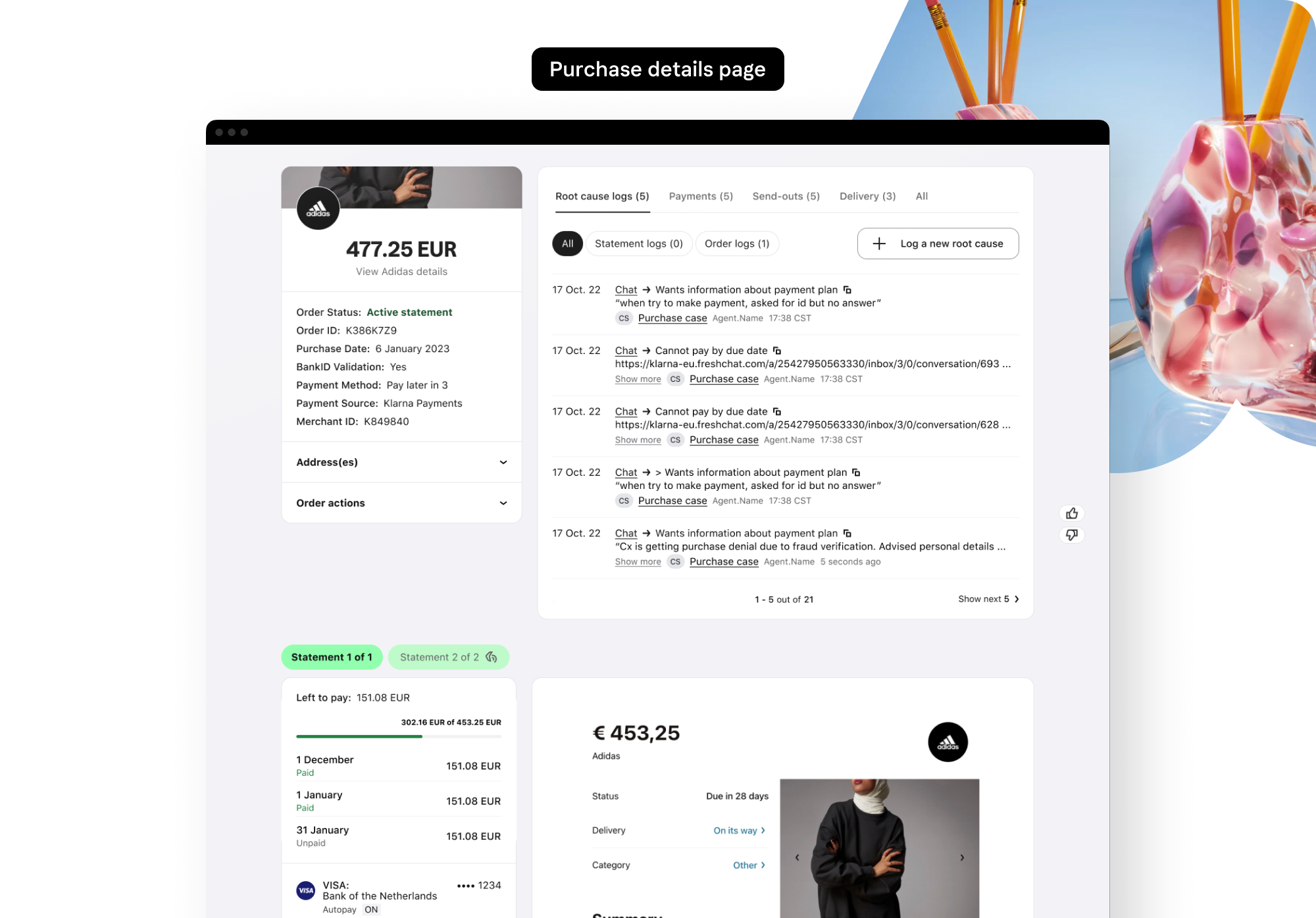
Testing & validation after the vision design got signed off
We ran 2 intensive on-site agent’s user testing & feedbacks to validate our proposed design.
The feedbacks were overall positive. Generally, the agents like the new layout. Key words mentioned were “clean”, “more organized”, “nice”, “fun”
I let the Product Designer take charge in moderating and facilitating the agent’s hearing & testing, and ensure they worked very closely with the Product Manager
I also supported the review of the rest of the dashboard’s screens to ensure the new Design system for B2B products in Klarna is properly implemented
However, I also made sure that the designer can drive the design facilitation on their own, and can confidently drive the design direction on their own.
We were constantly collecting and learning all possible flows & requests to potentially “cherry pick” opportunities into the delivery as well as for roadmap prioritization.
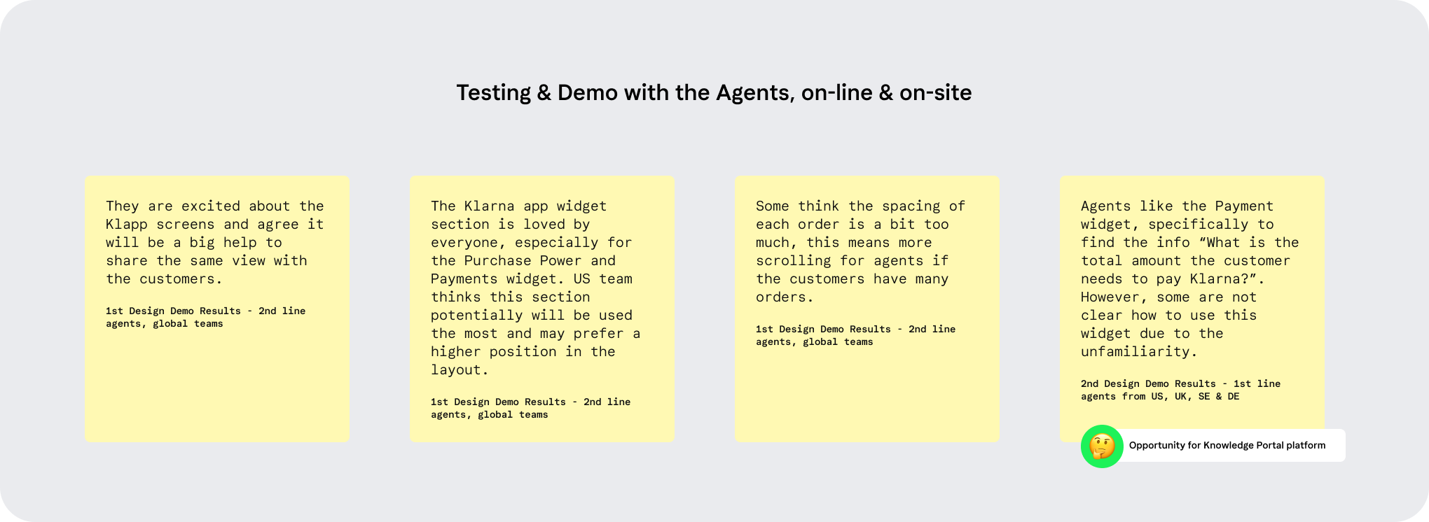
Some notable feedbacks from our global agents:
My Product Designer since then has built a more complete product based on the original vision, with many reusable components from our consumer Klarna app. This helps the agent do their job better by closely monitoring what are the current financial status of the customer and the payment status of their orders. Development also benefits from this reusability, which brings a lot of teams closer together and boost up cross-domain’s collaboration.
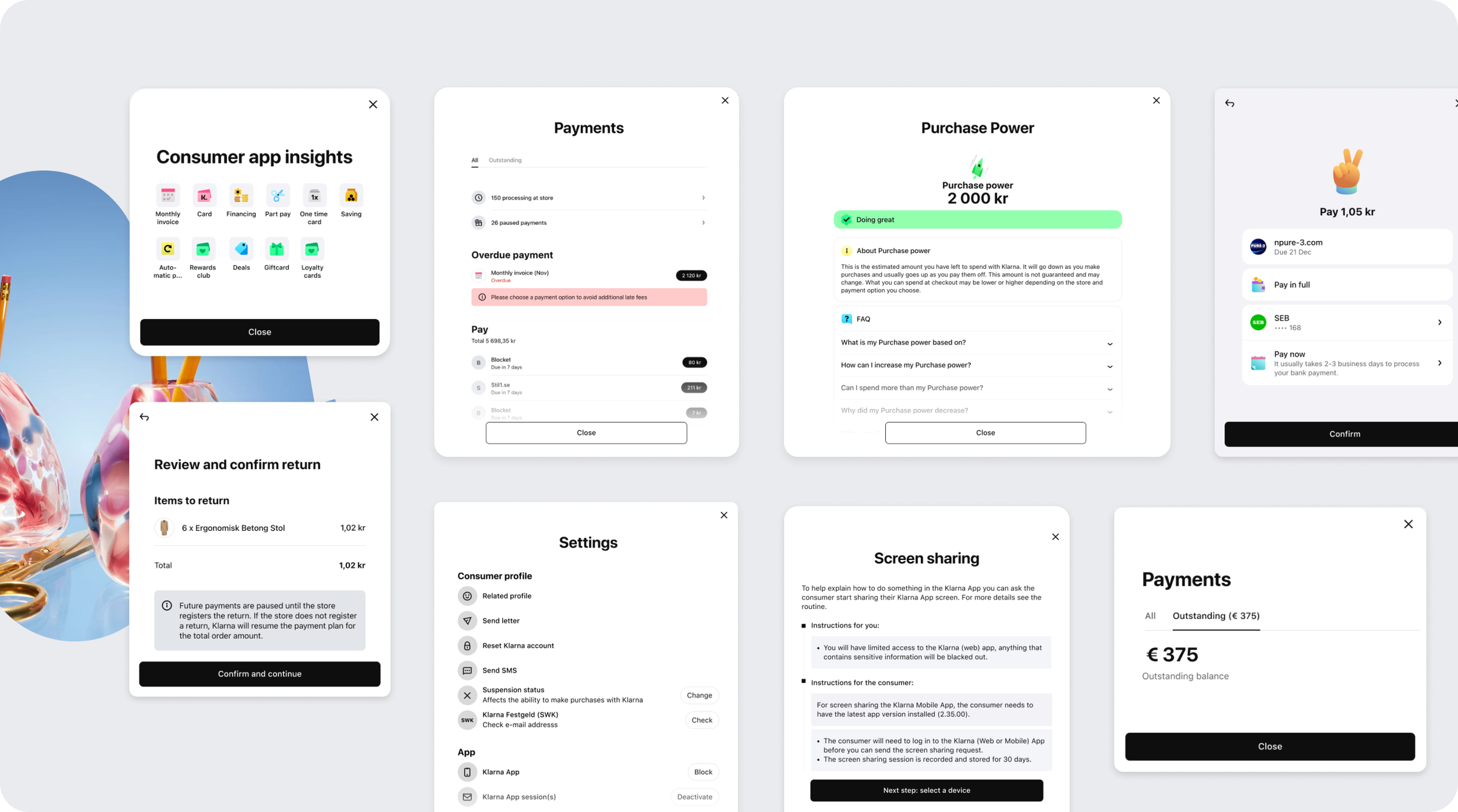
After 3 months of hard work…
The first MVP has been implemented and signed off by our CPO office :). We are excited to be able to help thousands of Customer Service’s agents do their job faster, easier and also make their day better by using the tool!
- More complete design will be shared upon request -