H&M App Post-Purchase & My account
Role: Lead Designer, working together with a UI designer and 2 fellow Product Designers
Stakeholders: My account PO, Loyalty & Marketing teams, Supporting 2 other teams around Membership
Product team: 1 Front-end, 1 iOS, 1 Android, 1 Data Analyst, several back end engineers, Scrum Master & PO
Mission
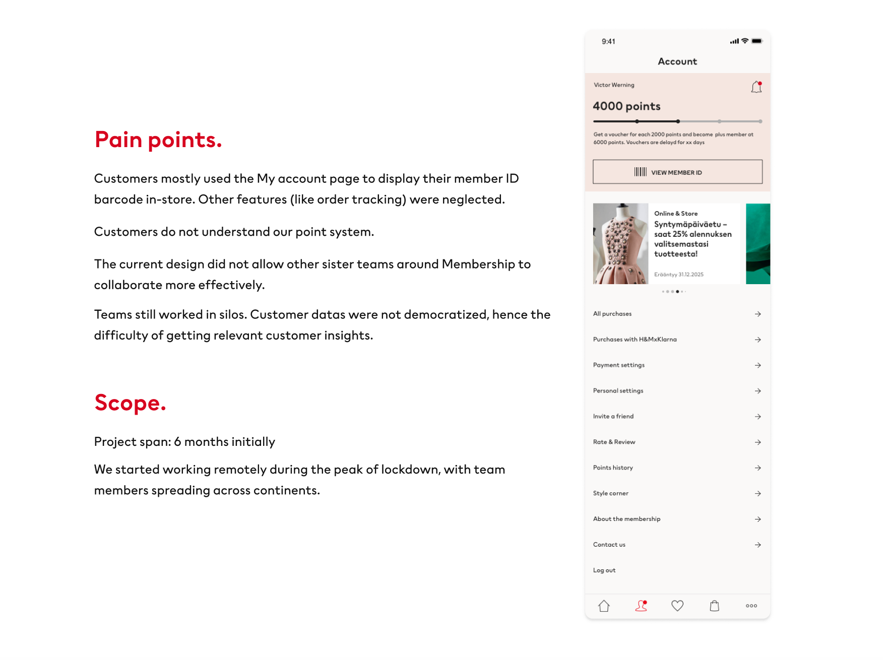
The My account cluster pages were not dynamic and inspiring. Membership perks are not highlighted (points, vouchers & offers). Navigation to Post-purchase was not intuitive hence large volumn of customer service calls.
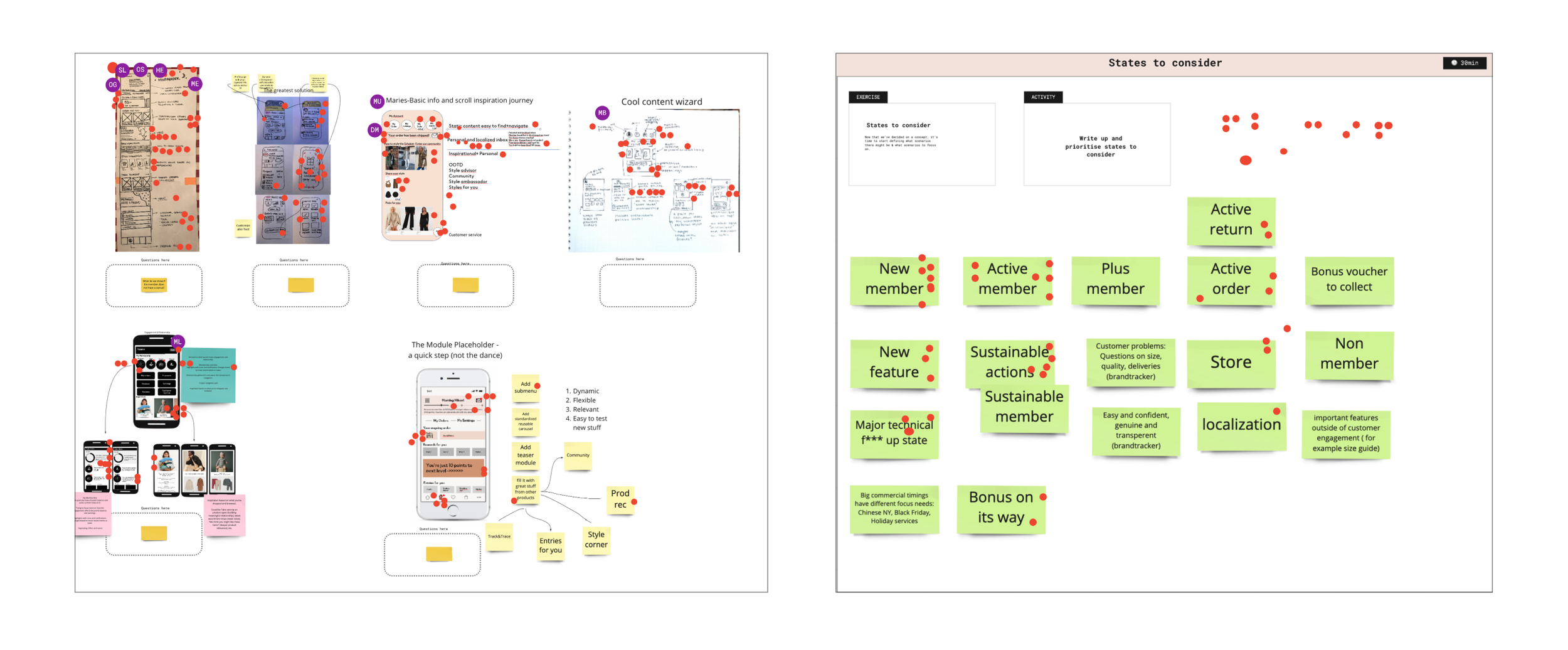
Kick-off: Remote design sprint
Why?
To bring the new team together and test the remote design sprint concept.
To ideate for the new design of My account.
To come up with some low-fi wireframes as foundation for UI exploration as next step.
What did we learn?
We were not sure about the data & insights to support our ideas.
We did not have enough insights on different markets / regions, e.g., Customers in China use totally different payment/financial services information for payment settings.
Remote design sprint was difficult for a big team and requires extra facilitation.
Gathering customer insights
Information sensitive. Will be shared when presented.
Usability testing
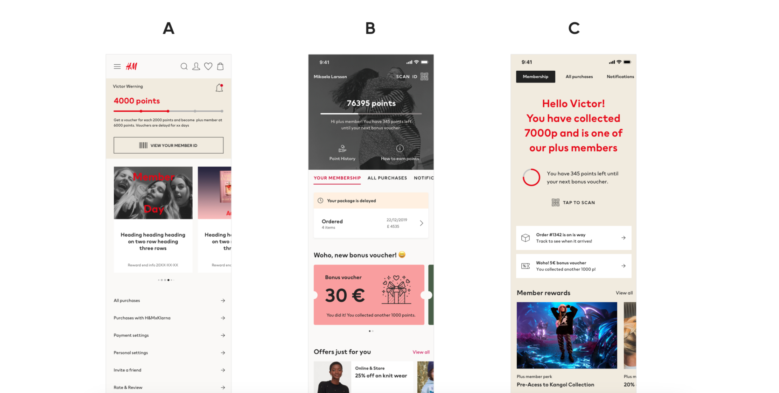
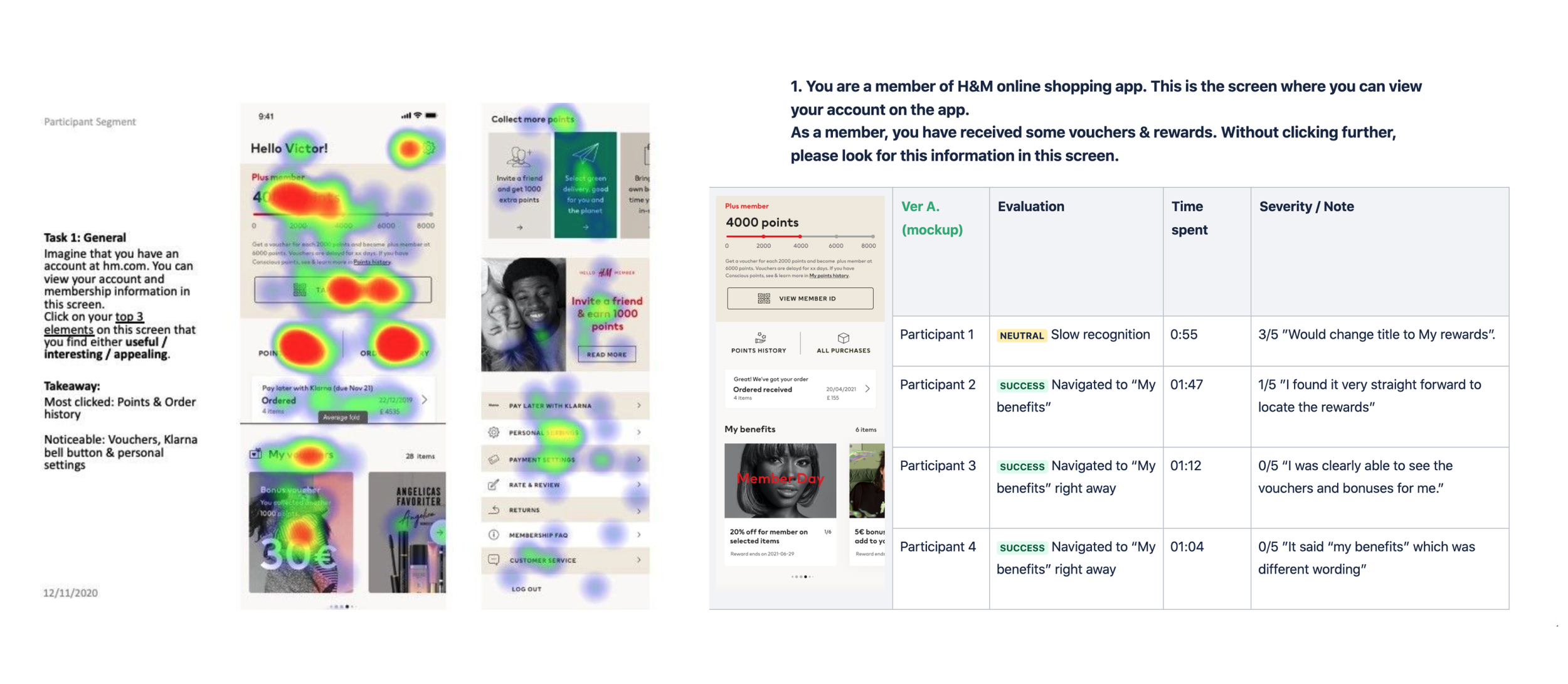
Perception test.
We ran surveys with 200 participants from the US & UK to know the strengths & weaknesses of each mockup. We decided to iterate & refine on A because of high risk of redesign of B & C, and the expectation of many users to have a simple and less clustered layout of A.
Validation test.
We tested the hypothesis of having Order tracking & Point history navigation menu above the fold.
The test was a success to validate our new layout. We lost a Data analyst during this time, hence the lack of AB testing validation.
The design decision
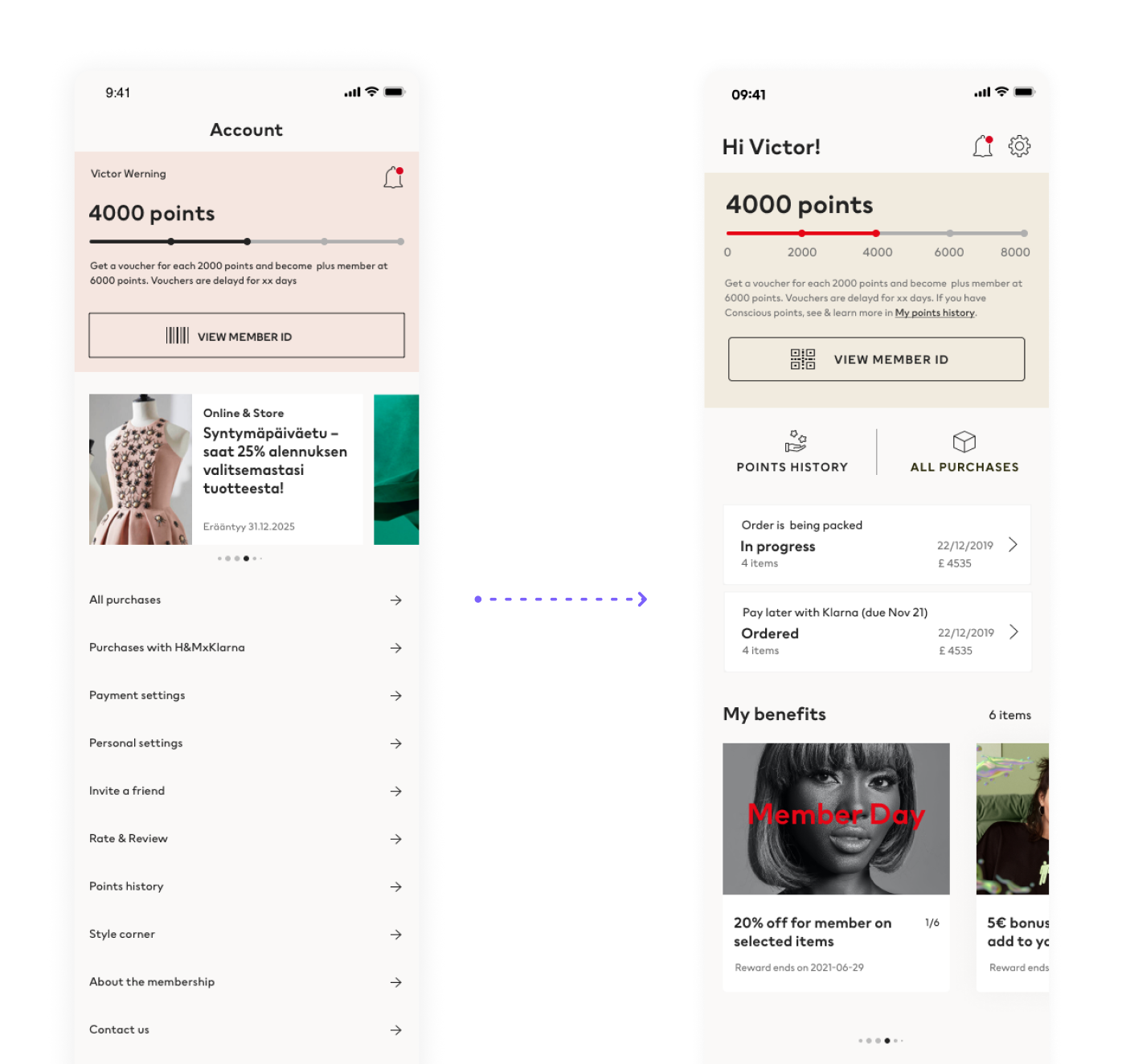
We decided to ship this design in batches according to our sprint planning, and to minimize the risk of complete redesign.
Also to monitor what is working and not.The new design has improvement on making the navigation to point history & order tracking more prominent and intuitive. We hope to reduce the customer service phone calls regarding on-going orders.
My benefits (vouchers and offers), and Latest News are part of the new vision to make My account cluster more personalized and inspiring.
Constraints:
Rebranding from Branding team also happened at the same time
Design system team was pre-mature then, hence the limitation of adding new UI components. We worked with what we already had.
Impact of the new design
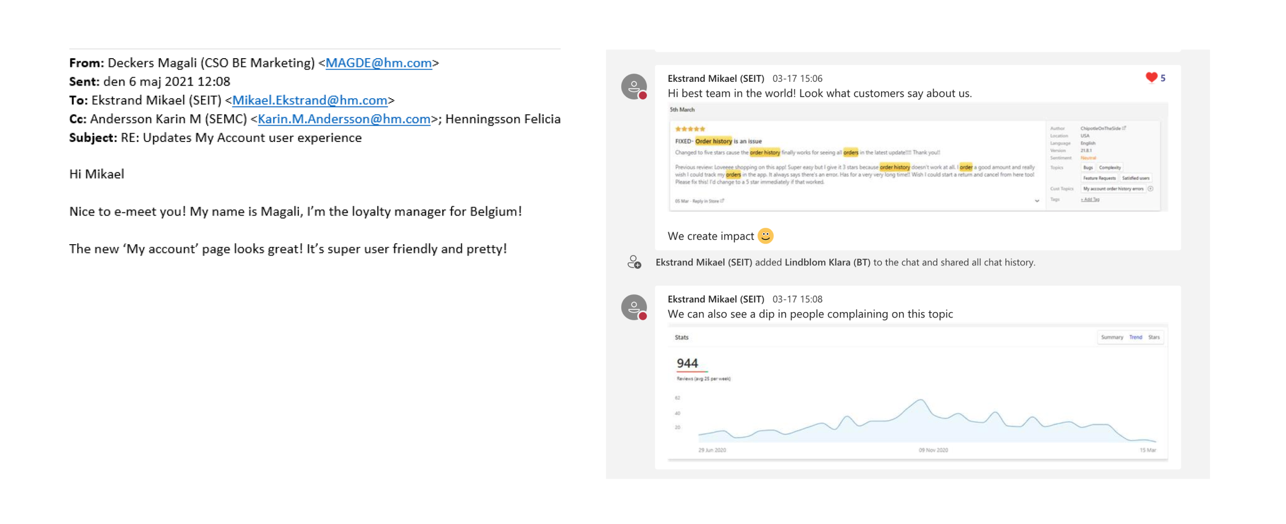
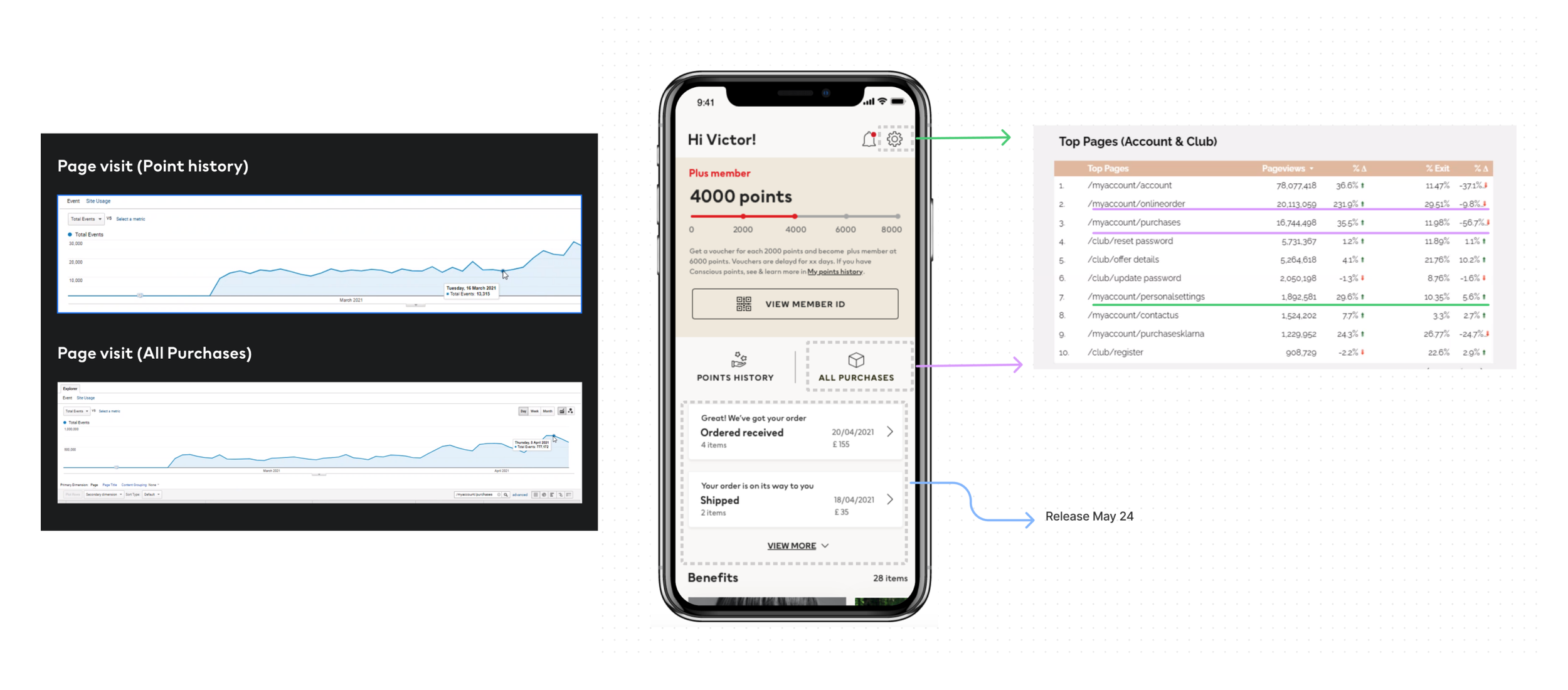
We as a team reached the most important milestone: Point history & Order tracking improved their page visit significantly.
Also we witnessed a surprising page visit uplift of the new Personal settings navigation.
Most importantly, customers & stakeholders were happy :). More important than numbers.